Find Your Home Decor Style: A Simple Room-by-Room Plan
A cohesive home starts with clarity—about what feels like “you,” what works for daily life, and what fits your space and budget. The goal isn’t to chase a perfect showroom look; it’s to create repeatable decisions so each purchase supports the bigger picture. Below is a practical process to pinpoint a personal decor direction, translate inspiration into simple rules, and shop with confidence so rooms feel intentional (not random) from space to space.
Start with how the home should feel (before choosing a “style name”)
Style labels can be helpful, but they often come too late in the process. Start with emotion and real-life function, then let the “style” reveal itself.
- Pick 3–5 feeling words that describe the ideal vibe (calm, bright, grounded, playful, tailored, cozy).
- Note daily-life needs that influence decor decisions: pets, kids, work-from-home, entertaining, low maintenance, allergy-friendly materials.
- Identify what must stay (so the plan works with existing flooring, cabinetry, or inherited furniture) and what can change quickly (textiles, art, lighting).
- Set “non-negotiables” so beauty and function align (washable rugs, closed storage, blackout curtains, warm lighting, etc.).
Feeling-to-Design Translation Cheat Sheet
| Desired feeling | Color direction | Materials & texture | Typical shapes/lines | Lighting cues |
|---|---|---|---|---|
| Calm | Soft neutrals, muted greens/blues | Linen, light woods, matte finishes | Simple silhouettes, gentle curves | Warm, diffused lamps; layered lighting |
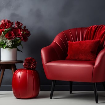
| Cozy | Warm neutrals, terracotta, deep accent tones | Bouclé, wool, aged woods, brushed metals | Rounded edges, plush forms | Lower Kelvin bulbs; plenty of lamps |
| Bright & airy | Crisp whites, pale tones, high contrast accents | Glass, light oak, airy sheers | Clean lines, open spacing | Daylight-friendly shades; reflective surfaces |
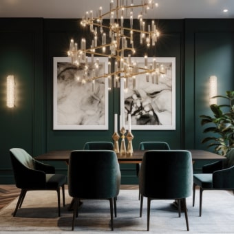
| Tailored | Classic neutrals, black accents | Leather, stone, polished metals | Straight lines, symmetry | Statement fixtures; controlled pools of light |
Collect inspiration with rules that prevent overwhelm
Inspiration becomes useful when it turns into patterns you can repeat—especially in a real home with real constraints.
- Use a “10-image set”: gather 10 interiors that feel right, then look for repeating themes instead of copying one room.
- Tag each image fast: color palette, materials, furniture shapes, and one memorable element (a pendant style, an art scale, a rug pattern).
- Remove outliers: if an image only works because of architecture (giant windows, ornate molding), don’t force decor to do that job.
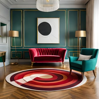
- Aim for 70/20/10: 70% foundational neutrals, 20% supporting color/material, 10% bold accent (pattern, art, or a standout piece).
For color direction and trend context, it can help to browse curated sources like Pantone Color Institute, then cross-check how those colors show up in real homes on Architectural Digest or Houzz.
Define a personal style recipe (palette, materials, and shapes)
Think of your style as a short “recipe” you can follow in any room. When decisions get hard, return to the recipe and the answer usually becomes obvious.
- Choose a base palette (2–3 neutrals) plus 1–2 accent colors; keep undertones consistent (warm with warm, cool with cool).
- Pick 3 core materials to repeat across rooms (for example: light oak, black metal, linen) for instant cohesion.
- Decide a shape direction: mostly curved (soft, organic) or mostly straight (structured, modern). Mixing is fine—choose a dominant lane.
- Select a “signature detail”: a finish (brass), a motif (stripes), or a subtle era influence (mid-century, cottage, contemporary).
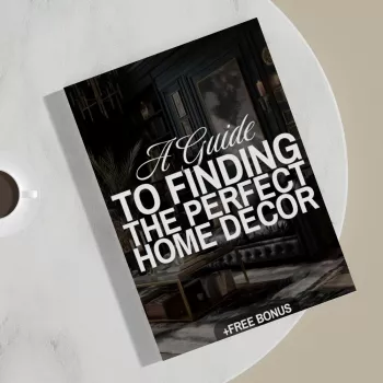
If you want a guided way to capture this recipe and keep it consistent as you shop, A Guide to Finding the Perfect Home Decor (Digital Download) organizes the process into quick prompts and a printable checklist.
Measure first, then plan the room in layers
Most “something feels off” rooms aren’t missing more decor—they’re missing correct scale, layout logic, or layered lighting. Measurements keep you from buying pieces that technically fit but function poorly.
For kids’ spaces, “function first” might mean storage that still looks like decor. A playful focal piece like the Castle Shape Children’s Bookshelf can act as both organization and a built-in theme cue (shape direction + signature detail) without requiring a full room makeover.
Use a checklist to shop smarter (and avoid expensive mismatches)
Sometimes the most dramatic improvement is a clean, even paint finish—especially when your style recipe calls for fresh neutrals or a high-contrast accent wall. For bigger refresh projects, the High Pressure Airless Paint Spray Gun & Hose Kit with Extension Rod can help you move from “good enough” to crisp and consistent coverage, which makes decor choices look more polished.
A simple path to confidence: the digital guide + printable checklist
What’s inside the process (at a glance)
| Step | Outcome | What to write down |
|---|---|---|
| Clarify the vibe | A clear direction | 3–5 feeling words + non-negotiables |
| Build a palette | Colors that work together | Neutrals + accents + undertones |
| Choose repeat materials | Cohesion across rooms | Top 3 materials + 1 signature finish |
| Plan by layers | Fewer wrong purchases | Large pieces first, then lighting, then finishing touches |
FAQ
How can a decor style be defined if preferences are mixed?
Use a style recipe instead of a single label: keep undertones consistent, repeat three core materials, and choose one dominant shape direction. Then let one or two accents reflect the “secondary” preference so it feels intentional, not chaotic.
What should be purchased first when decorating a room from scratch?
Start with the layout and the largest functional pieces (sofa, bed, dining table), then add a correctly sized rug and layered lighting. Save accessories and smaller decor for last so you’re not decorating around the wrong scale.
How can a room look cohesive without buying everything as a set?
Repeat a limited palette and a few finishes across the space (for example: black metal + light wood + warm white), keep scale consistent, and use one statement item to create a clear focal point.


Leave a comment