AI Moodboards Workflow: Fast, On-Brand Visual Direction
AI Moodboards: A Practical Digital Guide for Designers, Creatives, and Brand Builders
Moodboards move faster when AI handles the heavy lifting: gathering references, generating visual directions, and exploring variations before committing to a concept. The goal isn’t to replace taste—it’s to reduce the time spent searching, guessing, and starting over. With a simple system, AI-assisted moodboards can feel intentional, on-brand, and ready to share with clients or teams, while keeping creative control where it belongs: in curation and decision-making.
What a Moodboard Needs to Communicate
A strong moodboard isn’t just “pretty images.” It’s a decision tool that communicates direction clearly enough that others can build from it.
- A clear purpose: brand identity, campaign concept, product launch, interior direction, or a content style guide.
- A visual thesis: the emotion and story (for example, “warm minimal,” “neo-vintage,” or “playful tech”) expressed through cohesive references.
- Decision-ready constraints: target audience, medium (web, packaging, social), and must-keep elements (logo rules, accessibility, tone).
- A consistent mix of ingredients: color, typography cues, imagery style, textures, layouts, and key motifs.
- A short narrative: a few sentences explaining how the board supports the project goal.
When stakeholders ask, “So what does this mean for the design?” the board should answer that instantly through both visuals and brief annotations.
Best Places to Use AI in the Moodboard Workflow
- Direction discovery: generate multiple stylistic routes quickly to compare options.
- Reference expansion: find adjacent aesthetics, eras, materials, and visual metaphors you might not think to search.
- Palette exploration: propose color families and combinations aligned with the intended emotion (then validate contrast for usability).
- Image generation: create missing references when specific scenes or compositions are hard to source.
- Consistency checks: compare elements so the board feels like one world, not a collage of mismatched assets.
AI is most useful when it’s boxed into a job: expand options, fill gaps, or test variations—then step back so a human can choose what actually fits.
Step-by-Step: From Brief to a Shareable AI-Assisted Moodboard
1) Write a direction statement and non-negotiables
Start with one sentence that includes emotion + audience + context, then list 3–5 non-negotiables. Example: “Confident, modern wellness for busy professionals on mobile-first landing pages” + “high contrast, editorial type, no pastels, natural textures.”
2) Collect baseline references manually (your anchors)
Gather 5–10 references from existing brand assets or trusted sources. Anchors reduce randomness and keep AI from steering into clichés. If you’re building a physical-world product vibe, photograph textures, packaging, or materials that matter.
3) Ask AI for three creative lanes (and name them)
Generate three distinct routes and label them with simple names like “Soft Industrial,” “Modern Heritage,” or “Bright Modular.” Naming makes feedback easier: stakeholders can react to “Lane B is right, but less glossy” instead of vague opinions.
4) Build each lane with a repeatable ingredient list
- Hero imagery style: subject matter, lighting, depth, and composition.
- Supporting textures/patterns: materials, grain, gradients, paper, fabric, or UI surfaces.
- Layout cues: grid density, whitespace, framing, asymmetry, collage vs. strict alignment.
- Typography characteristics: serif/sans, contrast, x-height feel, editorial vs. tech, and pairing style.
5) Curate aggressively, then unify
Remove anything that doesn’t serve the direction statement. Fewer, stronger pieces beat a crowded board. Then unify: align aspect ratios, add consistent margins, and limit competing focal points so the hero image leads the eye.
6) Add annotations and export deliverables
Prompt Patterns That Produce Usable Moodboard Material
| Use case | Template inputs to specify | Good constraints to add |
|---|---|---|
| Brand identity direction | Audience, values, differentiator, emotion, category | No clichés, avoid competitor colors, accessibility-friendly contrast |
| Campaign concept | Product, seasonal cue, key message, channel (social/OOH/email) | One hero motif, limited palette, consistent lighting |
| Website visual style | Page type, layout density, typography vibe, imagery type | Large type, strong grid, minimal icon style, whitespace |
| Packaging inspiration | Format, shelf context, materials/finish, tone | Readable at distance, clear hierarchy, print-safe colors |
Keeping Results On-Brand (Without Over-Generating)
For digital products and brand touchpoints, contrast and readability matter as much as style. When you finalize palettes or typography direction, sanity-check accessibility guidance like the W3C WCAG overview.
Practical Tool Stack for Building Digital Moodboards
For foundational design thinking that supports better boards, references like Nielsen Norman Group’s visual design basics and Interaction Design Foundation’s color theory help connect aesthetics to usability.
Common Pitfalls and Fast Fixes
Using the Digital Guide to Build a Repeatable System
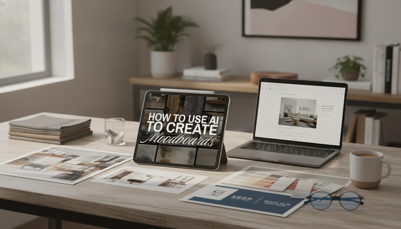
If you want a structured, ready-to-use workflow, the digital resource How to Use AI to Create Moodboards | Digital Guide for Designers, Creatives, Entrepreneurs, and Branding Inspiration is built for fast iteration and clean client-ready exports.
To support moodboarding for real product worlds, it can also help to keep a small set of tangible references on hand. For example, a decor concept lane might benefit from object styling cues like the Resin Reading Rabbit Figurine – Cute Animal Sculpture for Kids’ Room Decor, while jewelry branding boards can sharpen finish and material direction with references inspired by pieces like the 3mm Moissanite Tennis Bracelet for Women in 925 Sterling Silver with Gold Plating.
FAQ
What should be included in a digital moodboard for branding?
Include the emotion/story, color direction, typography cues, imagery style, textures or patterns, layout inspiration, and short annotations that connect visuals to brand goals and constraints.
How many images should a moodboard have?
A focused range is usually 12–25 images, with one clear hero image, a few supporting anchors, and enough variety to define the world without overwhelming reviewers.
How can AI moodboards stay original and not feel generic?
Keep strong constraints, start from curated anchors, maintain a “do not include” list, mix reference domains, and iterate in small batches so you refine direction rather than generating endless options.


Leave a comment